The Lookup field enables you to “look up” data from another form’s entries. Learn more about creating data lookups.
Label
The label will display as the title of the field or the question that is being asked on the form. You can select the icon on the right to hide the label on the form. You also can use the pop-up formatting toolbar to insert values from other fields on the form.
Values from protected fields cannot be inserted into the field label.
Type
The Type option determines how the choices will appear on your form.
Drop Downs
Drop Downs allow users to select one of the choices from a menu. The user must click into the menu in order to see the choices that are available.
Radio Buttons
Radio Buttons allow users to see all of the options, but only choose one of the choices.
Checkboxes
Checkboxes allow users to see all of the choices and check all that apply.
Placeholder Text
Placeholder Text is a short prompt that describes the expected value of an input field. The prompt is displayed in the field before you enter a value, and disappears when you begin typing.
Look Up Choices From
You must be an Administrator of a form to look up the form data. We do not recommend making any sensitive data available through the Lookup field – the data will be loaded behind the scenes and could potentially be exposed.

Select the source form from the list of available forms in your organization. Please note that:
- Once you save your form, the lookup source cannot be changed.
- By default, you cannot look up data from encrypted forms – you must specifically allow the entry data to be available under the form settings. However, if you set up a Lookup field prior to enabling encryption, the Lookup field will continue to work.
- The Lookup field will still look up data from forms that have been archived (but not deleted).
- When you delete an entry from the source form, that lookup choice value will disappear. Likewise, when you delete a field from the source form that’s referenced by the Lookup field, that data will also be gone, and an error message will appear in the Lookup field settings until you update the form.
- Instead of deleting data from the source form, we recommend that you hide the inactive options by filtering your choices.
- After saving your form, hover over its name in the sidebar and click the ellipsis (…) to open the form menu. Select Form Details to view a list of forms that reference or are referenced by the form through the Lookup or Person field.
Choice Label
When you create a Lookup field, all of the field data from the source form is available to you.
Choose the field from the source form that will populate the Lookup field. The label is the data associated with the field, and will be exported with the form. By default, the choice label automatically populates the first text field on the source form. Typically, you will choose just one field – but you can add multiple fields as needed. If you need to add extra information to your choice options that you do not want include as part of the data, you can include that information in the choice description.
When selecting lookup values in the conditional logic builder, choice options with identical values only appear once in the dropdown. To target an individual lookup value, you must open the Advanced Editor and specify the value using the corresponding entry number (ex: =(Product = 243).
Choice Description
The choice description provides extra information about each choice value. It does not display as part of the value, and will not be exported with the form. The description can include text as well as any data from any field on the source form.
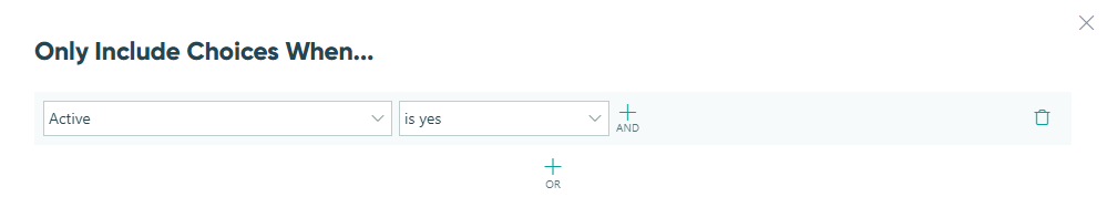
Include
By default, all entries from the source form will be included as choice values in the Lookup field. However, you can use the Include option to filter choice values based on your own criteria. You can update the filter at anytime, and when you change the filtered values, the previously selected choice value will still be there when you update the entry.
Cascade Filters
When you delete a Lookup field, any linked filter fields will be deleted as well!
You can select Add Cascade Filter to filter a subset of choices from the Lookup field:
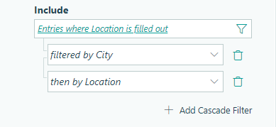
The filtered choices will appear in a separate filter field. Text values will display in alphabetical order while numerical values (such as dates and numbers) will display in ascending order.
You can set the field type (Drop Down, Radio Buttons, or Checkboxes) and add up to three cascade filters to create a series of cascading lookups.
Default Choices
Automatically populate the choice value for the user. The user can then choose to change the default value before submitting the form. Similar to the Include option, you can set a default choice that changes depending on what users select on the form.
Sort By
Use the sort function to determine how to sort choice options (ex: sort a list of products by price from low-high). By default, choice options are displayed alphabetically.

Collect Payment
Assign prices to each choice option. Using the Price dropdown, select a field on the source form to look up the price value and collect payment.
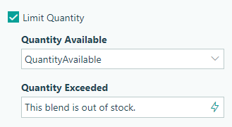
Limit Quantity
Set quantity limits and track quantities for the Lookup field. Quantity limits are updated and enforced when selections are made, and then again before forms are submitted. If the limit is exceeded, an error message is displayed. Quantities are only counted for submitted entries, not incomplete or deleted entries. To set quantities for the Lookup field:
-
Open the source form.
-
Add a Number field to track the quantity limit (ex: ‘Inventory Available’).
-
In the source form entries, specify the available quantity for each item in the corresponding Number field.
-
Open the form containing the Lookup field and find the Limit Quantity option in the Lookup field settings:
- Quantity Available – Select the Number field on the source form containing the available quantity for the current choice option.
- Quantity Exceeded – Write a custom error message (‘Out of stock!’) to display when the limit is exceeded. This message can include static text, or you can use the Calculation Editor to create a dynamic message that changes depending on the quantity remaining.
Specify Quantity
This option is only available when the field type is set to Radio Buttons or Drop Down.
When collecting payment and/or limiting quantities, you can select this option to map a quantity value to the Lookup field. The mapped quantity field can be either a Number (Integer) or Calculation (Number, Zero Decimals) field on the form.
If payment is enabled, the selected quantity will automatically be multiplied by the price of the selected choice option to determine the total price in the payment block. If quantity limits are enabled, the selected quantity will be applied to the quantity remaining.
Help Text
Help text can be used to assist the user by providing additional instructions. Help text will display directly under the field. Use the formatting toolbar to format text, insert hyperlinks and images, and populate values from other fields on the form.
Values from protected fields cannot be inserted into the help text.
Show This Field
By default, fields will always display on the form. However, you may want to hide specific fields or sections based on certain conditions, such as a selected value of another field on the form.
- Always – Field is always shown.
- When – Field will only display when specific conditions are met. After selecting this option, the Conditional Logic Builder dialog will display allowing you to select when the field or section should be displayed.
- For Roles – Field will display only when accessed via a role-based workflow link specific to the role(s) selected.
- Never – Field will never display.
Require This Field
Requiring a field will make sure the user provides a response. When a field is required, an error message will display, and the form cannot be submitted until a value has been added to the field. Required fields are indicated by a red asterisk next to the label. By default, fields are never required.
- Always – Field is always required. User must provide a response in order to submit the form.
- When – Field is required only when specific conditions are met. After selecting this option, the Conditional Logic Builder dialog will display allowing you to select when the field is required.
- For Roles - Field is required only when accessed via a role-based workflow link specific to the role(s) selected.
- Never – Field is not required. This is the default behavior.
Read-Only
Set fields and sections as read-only to create simple workflows with your forms. All fields can be made read-only, with the exception of fields that are already read-only by default (Calculation, Price, Content, Page break, etc.).
- Always – Field is always read-only.
- When – Field is read-only when specific conditions are met. After selecting this option, the Conditional Logic Builder dialog will display allowing you to select when the field is read-only.
- For Roles – Field will be read-only when accessed via a role-based workflow link specific to the role(s) selected.
- Never – Field allows user input. This is the default behavior."
Custom Error
You can set a custom error message that will display under your field when specified conditions become true. The conditional logic builder will allow you to add any number of rules for validating your field. Learn more about the custom error option.