With the help of resizable fields, you can adjust your form fields to a variety of different widths, and even add up to six columns of fields per row. In this post, we’ll talk about a couple of best practices for designing well-structured and user-friendly multi-column forms!
1.Size fields appropriately
In terms of size, not all fields are created equal. For example, Date fields always contain the same number of characters (MM/DD/YYYY and HH:MM: AM/PM for the United States), so the Date field container can only be so big or so small. If you were to put just two Date fields on a single row, it would result in a lot of extra space:

While it’s okay to give your fields room to breath, some of this extra space may not be necessary. As I mentioned in a previous post, lengthier forms may appear more intimating and seem like more of a chore for users to get through. So, if you have the opportunity, take advantage of the ability to add additional columns and make your form more compact.
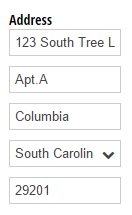
Remember: with great power comes great responsibility. While you can resize any field to your liking, some fields (like Address fields) may look a bit cramped when adjusted to their smallest possible width:
2. Group related information together
As I just mentioned, it’s a good idea to keep your form looking compact and concise. However, that doesn’t mean that you need to add as many fields as possible to each row; instead, focus on keeping related pieces of information together.
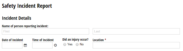
Visually, it makes sense to group dates together with their corresponding times:

Or, to group a degree together with a major and the number of years completed:

3. Keep it mobile-friendly
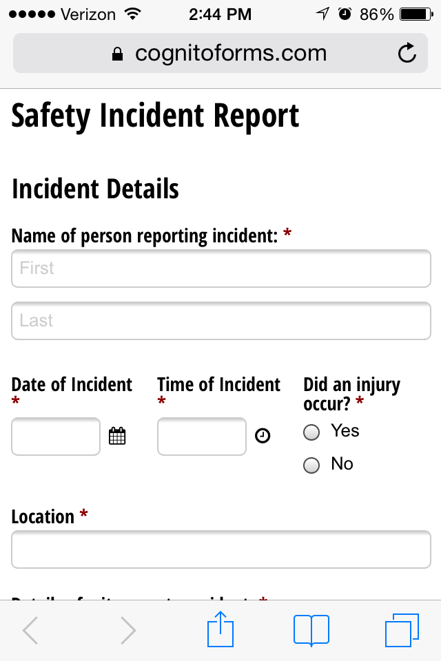
Cognito Forms are fully responsive and will automatically adjust to fit whatever device they’re accessed from. So, if you place variously-sized fields together on a single row:
The fields will maintain their general aspect ratios and shift accordingly in mobile view, with the smaller fields staying together and the larger fields each getting their own column:
In this case, if your forms are primarily intended for mobile users, you would probably want to make these fields a little bit larger so that they span one or two columns instead of three - the larger your form fields, the easier they are to read and fill out on a smaller screen.
Have any questions about designing forms, or Cognito Forms in general? Contact us today!

Nadia A.
Nadia, the Technical Writer for Cognito Forms, develops documentation, support content, and how-to videos. No matter your experience – with her help, you'll be able to take full advantage of the product. In her spare time, Nadia enjoys listening to French house, drinking coffee, and talking about herself in third person.