On the Publish page, you can customize the appearance of your public or embedded form. When you’re finished styling your form, make sure to hit Save.
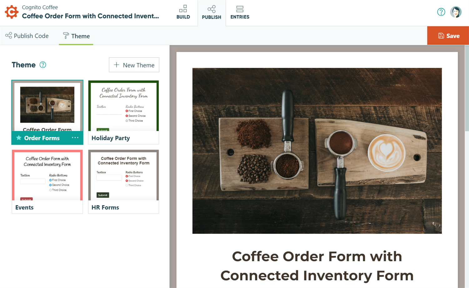
Theme
You can create up to 25 custom themes for your organization. All themes are available on the Publish page of every form.
Save time and keep your branding consistent with custom organization themes.
- Organization users can apply an existing theme to the current form on the Publish page.
- Organization Owners and Administrators can create, edit, and require custom themes.
Create a new theme
To create a new theme:
- Open the Publish page of any form.
- Adjust the logo, colors, fonts, and other form elements to your liking.
- Under the Theme tab, select the + New Theme button to save your changes as a new theme. Optionally, click the ellipsis (…) next to the theme name to set this theme as the default style for new or copied forms. To apply your new theme to existing forms, select the theme preview in the left-hand menu and click Save.
Require form themes
To require all forms in your organization to use a theme:
- Click your organization’s name in the top left corner and then click Settings.
- In the General section at the top, toggle Require Form Themes on.
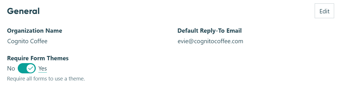
Once enabled, the Custom Styles option will no longer appear on the Publish page. If you have any forms already using custom styles, those styles will continue to work, but you cannot make further changes (other than saving the form with a theme).
Theme settings
Select a theme and then click the ellipsis (…) to edit the theme settings:
- Edit – Change the theme’s header/form/page styles. Click Save Theme to update every form using the theme. Once you update a theme, you cannot revert your changes.
- Rename – Change the theme’s name. Theme names must be unique and cannot exceed 25 characters.
- Make Default – Set the theme as the default for new forms or copied forms (but not existing forms or forms created from templates).
- Delete – Delete the theme. When you delete a theme, you must choose another theme to replace it. You cannot delete the default theme - you must first set another theme as the default.
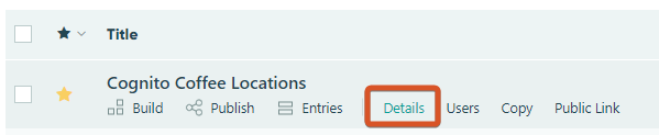
- Used by – View the number of forms using the selected theme. You can also select Details on your organization’s dashboard to see which theme a form is using.
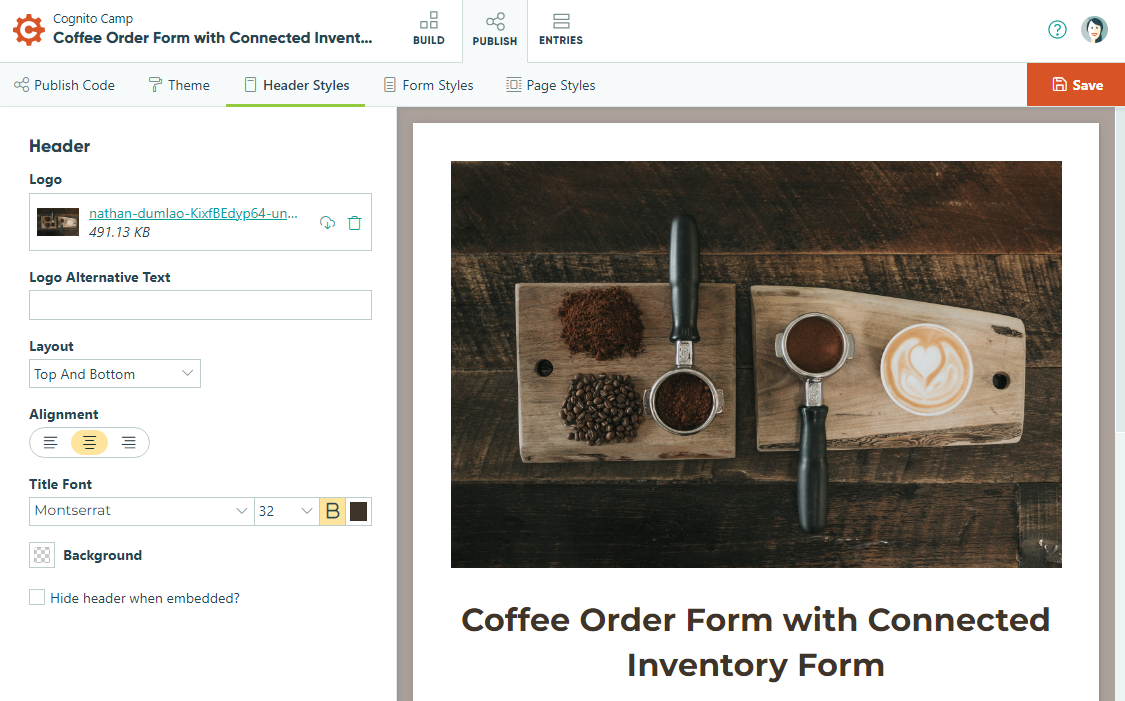
Header Styles
The styling options you select do not apply to your form’s generated documents.
- Logo – Click this button to upload an image to the top of your form. The Logo file must be smaller than 0.5 MB. Accepted file types include jpg, jpeg, png, gif, and svg files.
- Layout – Change the position of the logo and title to Top and Bottom (logo is on top of title), Side by Side (logo and title are in line), Stretch (the logo stretches to fill the header), and Logo Only.
- Background – Use the color picker to select a header background color. You can also make the background transparent.
- Alignment – Align your title/logo to the left, right, or center.
- Title Font – Select the font type, size, weight (normal or bold), and color of your form title.
- Hide header when embedded? – Check this box to hide the logo, title, and description on embedded forms. These elements will still appear on the public form page.
Form Styles
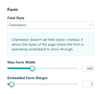
- Field Style – Choose between different styles of form fields (Standard, Chunk, Fill, Inset, etc.)
- Chameleon Mode – If you embed your form via the Seamless embed code, you can use the Chameleon field style to allow the styles of your webpage to apply to the form.
- Headings, Labels, Text, Links, and Button Text – Select the font type, size, weight (normal or bold), and color of text elements on your form. When you add a section within another section, the new section will have a smaller font size.
- Button Background – Use the color picker to select the background color of buttons on your form.
- Highlight – Use the color picker to select the highlight color for selected fields, values, and page numbers on your form.
- Placeholder Text – Use the color picker to select the placeholder text color on your form.
- Form Background – Use the color picker to select a form background color.
- Max Form Width – Use the slider to adjust the maximum width of your form between 200 and 2,000 pixels.
- Embedded Form Margin – Use the slider to adjust the margin around your embedded form between 2 and 80 pixels.
Page Styles
The page background image/color is not applied to a webpage when a form is embedded.
- Page Background – Use the color picker to select a page background color. You can also make the background transparent.
- Page Background Image – Click this button to upload an image for your page background. The file must be smaller than 2 MB, and only jpg, jpeg, png, gif, and svg files may be uploaded.
- Tile Background Image? – Check this box to tile your background image as a pattern.