The right field type does the heavy lifting for you: cleaner data, less cleanup, and a form people actually enjoy filling out.
Build Time & Skill
8-10 min
Beginner
What you'll learn
How to quickly identify the right field type for common data-collection scenarios, and avoid the mix-ups that cause messy data or clunky forms.
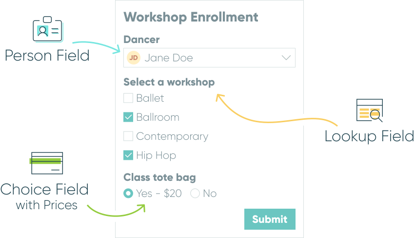
The fastest way to choose the right option is to ask a simple question first: what shape does your answer take? Is it a word, a number, a choice from a list, a specific person, a date, or a file? That gut-check gets you most of the way there. The real confusion shows up in the moments when two fields seem to do the same thing but behave very differently underneath – that’s what this guide walks through.
Picking the right field type from the start helps you:
- Collect cleaner data. The right field validates and formats input automatically, so you spend less time cleaning up typos and inconsistent entries.
- Avoid rebuilding forms later. Fields like Lookup and Person keep your data connected and easy to reuse, so you’re not stuck re-entering the same information across multiple forms.
- Give people a better experience. A form that asks for information in the right format – a dropdown instead of a wall of checkboxes, a Phone field instead of a Textbox – is faster and less frustrating to fill out.
- Unlock features you’d otherwise miss. Some field types (like Lookup, Person, and Price) power calculations, workflows, and payment collection that a generic Textbox simply can’t.
Common field type decisions
Here are the moments where people most often get stuck choosing between two fields that look alike on the surface.
Letting people choose from a list
Choice, Lookup, and Person fields all offer the same style options, and the one you pick comes down to a single question: should someone be able to select just one option, or more than one?
Dropdown and Radio Buttons
Dropdown and Radio Buttons only allow a single selection. Dropdown works well for longer lists since it tucks the options into a menu, while Radio Buttons display every option at once – ideal for short lists where you want people to see all their choices at a glance.

Checkboxes
Checkboxes allow multiple selections. Checkboxes work well for questions like “which services are you interested in?” or “select all that apply,” where more than one answer is valid.

Cards
You can also combine any of these styles with Cards for a more visual selection experience, like showing product images or icons; Cards support both single and multiple selection.

Limit how many checkboxes someone can select. By default, Checkboxes allow unlimited selections. To cap it – for example, “choose up to 3” – open the field’s Custom Error setting and add a condition using =(FieldName.Count() > 3), then write the error message that displays when someone tries to select more than your limit.
Capturing a simple yes-or-no answer
It’s tempting to reach for a Yes/No field any time you need a binary response, but the two fields aren’t interchangeable.
Yes/No field
A Yes/No field is built for opt-in and status-style questions – things like “Do you agree to the terms?” or “Is this customer active?”.
Its Require setting is called Require Yes Response, and it only enforces a positive answer. This makes it the right fit for consent checkboxes and active/inactive status flags, where only a positive response should ever be required.

Choice field
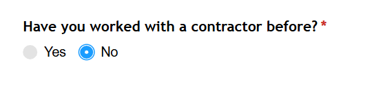
A Choice field with two options (like “Yes” and “No”) is the better fit when you need to guarantee a response either way, such as a required screening question or eligibility check where both “Yes” and “No” are acceptable answers, but leaving it blank isn’t.
Pulling in data from another form
Choice, Lookup, and Person fields all display a list of options, but what separates them is where that list comes from.
Choice field
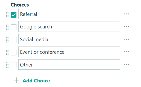
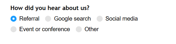
A Choice field has options that stay fixed until you edit them manually. This is the right call when your list is short and unlikely to change often, like a “Service Type” field with three or four fixed options.
 |
 |
|---|
Lookup field
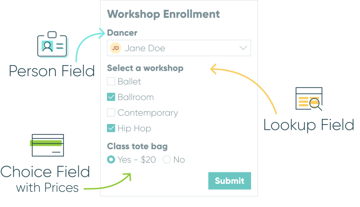
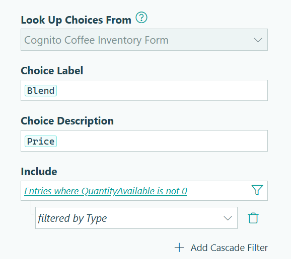
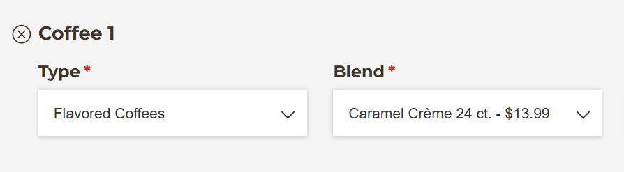
A Lookup field pulls its options from entries on another form, and it updates automatically whenever that source form changes. This is ideal for a product catalog or any list that needs to stay consistent across multiple forms.
 |
 |
|---|
Person field
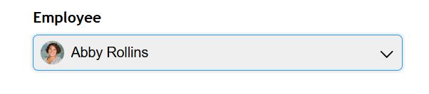
A Person field works like a Lookup field, but it’s specifically built for people – adding capabilities like defaulting to the current logged-in user or displaying a profile image. Use it any time your list represents known individuals, like clients, employees, volunteers, and more.
 |
 |
|---|
Collecting numbers and money
These three fields all collect numeric input, but each is built for a different kind of number.
Number field
Use a Number field for plain numeric values that aren’t money – quantities, ages, ratings, or percentages. You can set it to collect integers, decimals, or percentages, and display it as a textbox, spinner, or dropdown.

Currency field
Use a Currency field when you need to collect or display a monetary value, but you aren’t necessarily charging the person filling out the form. It automatically formats input as currency (like $1,234.56) without triggering an actual charge.

Price field
Use a Price field specifically when you want to collect payment. Unlike the Currency field, a Price field always processes a transaction through your connected payment provider. The amount can be fixed or calculated from other fields on the form, like multiplying a unit price by a quantity.

Repeating groups of fields
If someone needs to submit the same set of information more than once on a single form – multiple guests, multiple line items, multiple references – you have two options:
Repeating Section
A Repeating Section is a container that groups a set of fields together and lets someone add multiple instances of that entire group. You can set a minimum and maximum number of items, which is useful for requiring at least one entry or capping submissions at your event’s capacity.

Table field
A Table field does the same job as a Repeating Section in a more compact, spreadsheet-style grid. It even includes built-in column summaries like Sum, Average, Min, and Max for Number, Currency, and Price columns.

Collecting personal details
For personal information, a generic Textbox works, but it skips validation and structure that purpose-built fields handle automatically.
Name field
Use a Name field to break a name into subfields (First, Last, Middle Initial, Prefix, and more), which keeps data consistent and makes it easy to prefill one Name field from another.

Phone field
Use a Phone field to automatically validate phone number formatting – U.S. numbers are formatted as (###) ###-####, and extensions are supported.

Signature field
Use a Signature field to collect a legally binding electronic signature, drawn or typed, which a Textbox can’t do. You can also embed the collected signature directly into a generated Word or PDF document, like a signed agreement or waiver.

Address field
Use an Address field to collect a full address – street, city, state, ZIP – as structured subfields in a single field, rather than one long block of text. You can also default one Address field’s subfields based on another, like automatically setting a billing address to match a shipping address.

Additional features to explore
Once you’ve matched your fields to the right data, a few features help you get even more out of them:
- Conditional logic to show, hide, or require fields based on earlier answers – useful once your form has fields like Choice, Lookup, or Yes/No driving the rest of the experience.
- Calculations that reference Lookup and Person data, like pulling a price or contact detail from a selected entry without displaying it as a separate field.
- Quantity limits on Choice and Lookup fields, which prevent overselling tickets, appointment slots, or limited inventory.
Start choosing the right fields today
Most of these mix-ups aren’t costly on their own, but they can add up; messy exports, forms that are harder to fill out, and features you can’t use because the underlying field wasn’t built for the job. For the complete list of every available field type, visit our Form field reference page.
FAQ
A Choice field’s options are typed in manually and stay fixed until you edit them. A Lookup field pulls its options from entries on another form, so the list updates automatically whenever that source form changes. A Person field is similar to a Lookup field, but it’s built for representing people, like clients, customers, volunteers, and more.
A Textbox collects free text with no built-in validation, so it won’t catch a malformed phone number, an invalid URL, or an incomplete address. Purpose-built fields like Phone, Website, and Address validate and format input automatically, which means cleaner data and fewer follow-up emails asking someone to fix what they submitted.
Use a Table field when you want a compact, spreadsheet-style layout with up to 12 columns and built-in summaries like Sum or Average. Use a Repeating Section when each repeated item needs more fields than comfortably fit in a row, or when you want more visual space between entries. You can convert a Repeating Section into a Table field later if needed.