A Name field is used to collect a person’s name (first, middle, last) without having to create or manage multiple textbox fields.
Label
The label will display as the title of the field or the question that is being asked on the form. You can select the icon on the right to hide the label on the form. You also can use the pop-up formatting toolbar to insert values from other fields on the form.
Values from protected fields cannot be inserted into the field label.
Include
When you set a Name field to required, only the First and Last Name checkboxes are required for submission.
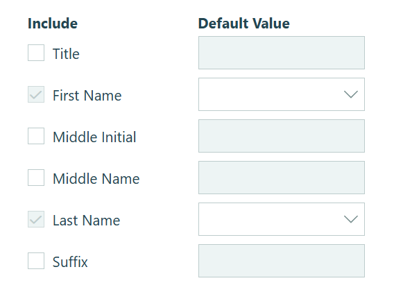
You have the option to include additional fields. First and Last will appear as default fields, but Title, Middle Name, Middle Initial, and Suffix can be added by clicking the respective check boxes.
Default Value
Default values can be used to automatically populate the field’s value for the user, who can then change it before submitting the form.
You can set a static default value for each subfield (First Name, Last Name, Middle Initial, Prefix, etc.), or use the dropdown next to each subfield to reference another field on the form. Supported field types include:
- Name field
- Textbox field
- Choice field
- Calculation field (Text type)
- Fields referenced through a Lookup or Person field (limited to the above field types)
A common use case is prefilling one name field based on another – for example, defaulting a second signer’s name to match a previously entered name. If all subfield defaults are currently empty, selecting a subfield reference from another Name field will automatically populate the corresponding defaults for all other subfields at once.
Default
Once a default value is set for any subfield, the Default option will appear. This controls when the default values are applied:
- Always – The form always populates the default values. This is the default behavior.
- When – Set a condition using the condition logic builder. When the condition is true, the default values are populated; when false, they are not.
Help Text
Help text can be used to assist the user by providing additional instructions. Help text will display directly under the field. Use the formatting toolbar to format text, insert hyperlinks and images, and populate values from other fields on the form.
Values from protected fields cannot be inserted into the help text.
Show This Field
By default, fields will always display on the form. However, you may want to hide specific fields or sections based on certain conditions, such as a selected value of another field on the form.
- Always – Field is always shown.
- When – Field will only display when specific conditions are met. After selecting this option, the Conditional Logic Builder dialog will display allowing you to select when the field or section should be displayed.
- For Roles – Field will display only when accessed via a role-based workflow link specific to the role(s) selected.
- Never – Field will never display.
Require This Field
Requiring a field will make sure the user provides a response. When a field is required, an error message will display, and the form cannot be submitted until a value has been added to the field. Required fields are indicated by a red asterisk next to the label. By default, fields are never required.
- Always – Field is always required. User must provide a response in order to submit the form.
- When – Field is required only when specific conditions are met. After selecting this option, the Conditional Logic Builder dialog will display allowing you to select when the field is required.
- For Roles - Field is required only when accessed via a role-based workflow link specific to the role(s) selected.
- Never – Field is not required. This is the default behavior.
Read-Only
Set fields and sections as read-only to create simple workflows with your forms. All fields can be made read-only, with the exception of fields that are already read-only by default (Calculation, Price, Content, Page break, etc.).
- Always – Field is always read-only.
- When – Field is read-only when specific conditions are met. After selecting this option, the Conditional Logic Builder dialog will display allowing you to select when the field is read-only.
- For Roles – Field will be read-only when accessed via a role-based workflow link specific to the role(s) selected.
- Never – Field allows user input. This is the default behavior."
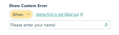
Custom Error
You can set a custom error message that will display under your field when specified conditions become true. The conditional logic builder will allow you to add any number of rules for validating your field. Learn more about the custom error option.