A Choice field allows users to select from predefined options in the form of a dropdown, radio buttons, or checkboxes.
Label
The label will display as the title of the field or the question that is being asked on the form. You can select the icon on the right to hide the label on the form. You also can use the pop-up formatting toolbar to insert values from other fields on the form.
Values from protected fields cannot be inserted into the field label.
Placeholder Text
Placeholder Text is a short prompt that describes the expected value of an input field. The prompt is displayed in the field before you enter a value, and disappears when you begin typing.
Selection Type
If you change the selection type from Multiple to Single on a form with existing entries, only the first selected choice will be retained. All other selected choices will be deleted.
Single
Only one choice option can be selected. Available styles: Drop Down, Radio Buttons, or Cards.
Multiple
More than one choice option can be selected. Available styles: Checkboxes or Cards.
Style
The Style option determines how choices will appear on the form.
Drop Down
Display choices in a menu. The menu must be clicked to view all available options.
Radio Buttons
Display all choices, but only allow one selection.
Checkboxes
To reference a Checkbox value in conditional logic or calculations, use the.Contains property (ex: =if ChoiceField.Contains(“First Choice”) and ChoiceField.Contains(“Second Choice”) then “Your text here” else null). Learn how to control the number of checkboxes someone can select.
Display all choices and allow multiple selections.
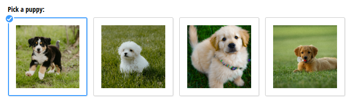
Cards
Display choices as clickable cards arranged in a grid layout. When selected, cards show a border in the form theme’s Highlight color.
Layout
This option is only available when the Style is set to Radio Buttons, Checkboxes, or Cards.
This option allows you to select how your options will display.
- One Column – Options will display vertically in a single column.
- Two Column – Options will display in a horizontal two column format.
- Three Column – Options will display in a horizontal three column format. This option only appears when your field spans two columns.
- Four Column – Options will display in a horizontal four column format. This option only appears when your field spans two columns.
- Side by Side – Options will display horizontally and will wrap onto the next line depending on the space available and the number of options. This is the default option.
Choice Options
Collect Payment
If you want to charge users based on what they choose in this field, check the box for Collect Payment for This Field. This will automatically select the Assign Prices? field and prompt you to connect your PayPal, Stripe, or Square account.
After linking a payment account, assign a price to each choice option. These prices calculate charges based on what is selected. Options left blank default to $0.00.
Assign Prices
This option will automatically be selected when you enable the Collect Payment for This Field option. You can also select “Assign Prices?” only, if you’d just like to assign prices to each choice. These prices can then be used in a separate calculated price field, such as for quantities.
Assign Values
Assign numeric values to each choice. These values (denoted as ChoiceField_Value) can be used in basic calculations – for example, to add, subtract, multiply, or divide based on the user’s selection. Because Choice field values are not Number fields, they are not compatible with numeric functions like Math.Max or Math.Min.
Limit Quantities
This option is only available when the field Selection Type is set to Single (Drop Down, Radio Buttons, or Cards.)
Set quantity limits and track quantities for each choice option. After you set your choice quantities, enter a custom error message to display when the limit is exceeded.
Show Images
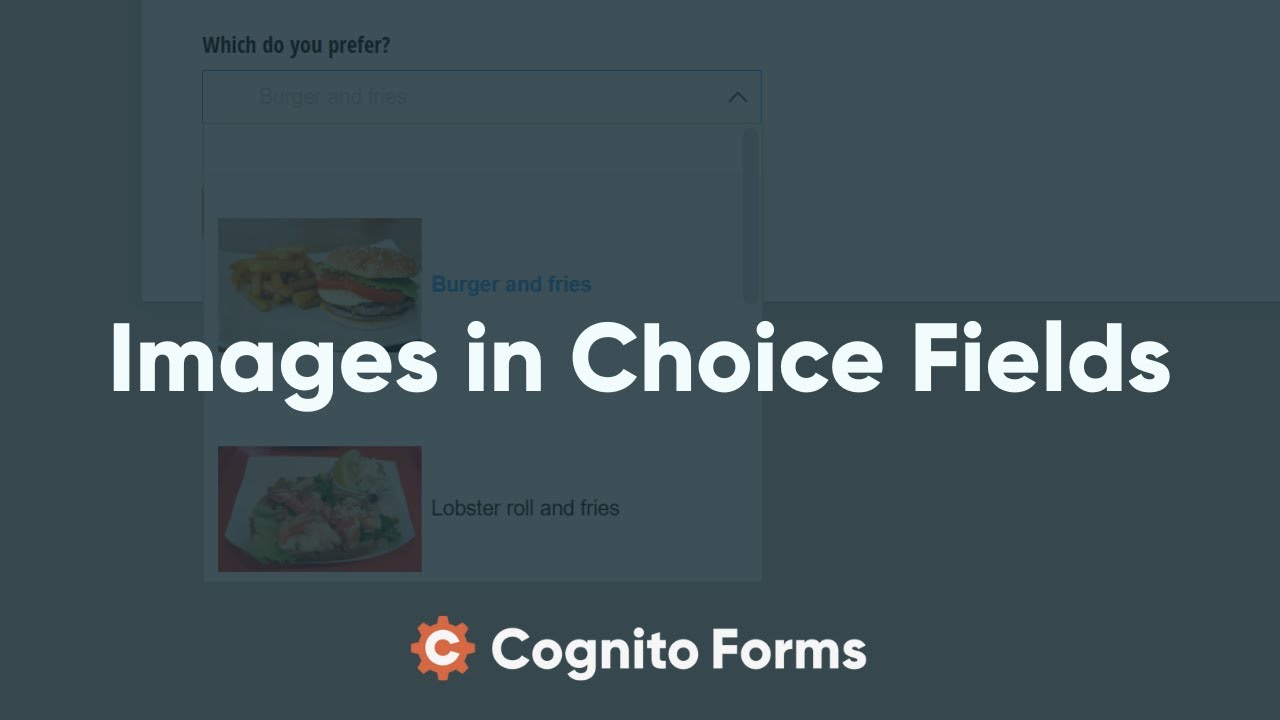
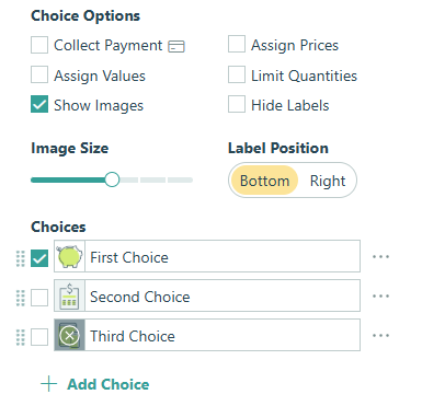
Upload images for each choice option. Click the image icon next to each choice or drag and drop an image onto the choice option. Supported formats include: jpg, jpeg, png, bmp, and svg. Image sizes cannot exceed 10MB.
Please note that images do not appear in generated documents or notification emails.
Hide Labels
Show only images with no labels on the form. Options without images will still show their labels.
Image Size
Control how large images appear relative to the form’s font size. The Cards style supports sizes 1-7. All other styles support sizes 1-4.
Label Position
For the Cards style, position labels at the bottom or right side of the choice image.
Choices
Choices are selectable options. Each choice option should be unique – we don’t support adding multiple choice options with the same label (ex: “Choice 1” and “Choice 1”).
Use the checkboxes to the left of each choice to set default selections. Add choices by clicking + Add Choice or click the ellipsis (…) next to a choice and select + Add Below to insert a new choice or Delete to remove it.
When referencing choice values in calculations, the text must match exactly, including capitalization and spaces. For example, if a choice option is "First Choice", your calculation must use "First Choice" – "first choice" or "FirstChoice" will not work.
Import choice options in bulk
You can copy choice options, prices, and values by selecting the first line of the choice label textbox and then pasting from Excel or another text editor. Choices, prices, and values must be tab-delimited (automatic when pasting from Excel) and separated by line breaks between choices.
Each line item will populate into the list below, eliminating the need to manually copy every item from long lists.
Show Prices in Choice Field
Use this option to display or hide assigned prices.
Specify Quantity
This option is only available when the field Selection Type is set to Single (Drop Down, Radio Buttons, or Cards.)
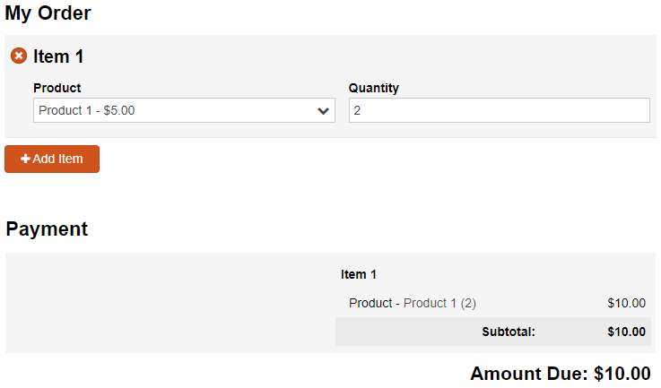
When collecting payment and/or limiting quantities, you can select this option to map a quantity value to the Choice field. The mapped quantity field can be either a Number (Integer) or Calculation (Number, Zero Decimals) field on the form.
If payment is enabled, the selected quantity will automatically be multiplied by the price of the selected choice option to determine the total price in the payment block. If quantity limits are enabled, the selected quantity will be applied to the quantity remaining.
Allow Fill In
The Allow Fill In option allows users to add their own choice that they fill in themselves. For Radio Button and Checkboxes, a textbox will display as the user’s last option. Allow Fill In is not available when the Collect Payment For This Field or the Assign Prices? option is enabled.
Learn how to determine if the Allow Fill In option is selected when using conditional logic.
Default Value
Default values can be used to automatically populate the field’s value for the user. The user can then choose to change the default value before submitting the form.
The default value can always be the same value or can change based on certain conditions such as a selected value of another field on the form. To set a changing default value, click the lightening bolt icon in the field to open the Conditional Logic Builder.
Help Text
Help text can be used to assist the user by providing additional instructions. Help text will display directly under the field. Use the formatting toolbar to format text, insert hyperlinks and images, and populate values from other fields on the form.
Values from protected fields cannot be inserted into the help text.
Show This Field
By default, fields will always display on the form. However, you may want to hide specific fields or sections based on certain conditions, such as a selected value of another field on the form.
- Always – Field is always shown.
- When – Field will only display when specific conditions are met. After selecting this option, the Conditional Logic Builder dialog will display allowing you to select when the field or section should be displayed.
- For Roles – Field will display only when accessed via a role-based workflow link specific to the role(s) selected.
- Never – Field will never display.
Require This Field
Requiring a field will make sure the user provides a response. When a field is required, an error message will display, and the form cannot be submitted until a value has been added to the field. Required fields are indicated by a red asterisk next to the label. By default, fields are never required.
- Always – Field is always required. User must provide a response in order to submit the form.
- When – Field is required only when specific conditions are met. After selecting this option, the Conditional Logic Builder dialog will display allowing you to select when the field is required.
- For Roles - Field is required only when accessed via a role-based workflow link specific to the role(s) selected.
- Never – Field is not required. This is the default behavior.
Read-Only
Set fields and sections as read-only to create simple workflows with your forms. All fields can be made read-only, with the exception of fields that are already read-only by default (Calculation, Price, Content, Page break, etc.).
- Always – Field is always read-only.
- When – Field is read-only when specific conditions are met. After selecting this option, the Conditional Logic Builder dialog will display allowing you to select when the field is read-only.
- For Roles – Field will be read-only when accessed via a role-based workflow link specific to the role(s) selected.
- Never – Field allows user input. This is the default behavior."
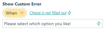
Custom Error
You can set a custom error message that will display under your field when specified conditions become true. The conditional logic builder will allow you to add any number of rules for validating your field. Learn more about the custom error option.