A signature field allows you to collect typed or handwritten electronic signatures from your users. When an entry with a signature is submitted, the signature appears with the rest of the entry information (as well as PDF exports) as an image.
Electronic signatures are legally binding per the eSIGN act of 2000. Please refer to our FAQ for further instructions regarding eSIGN compliance.
Electronic signatures are Base64 files, not images. If you want to send an electronic signature to another system using one of our data integrations, we recommend including the Signature as an image in a generated document.
Input
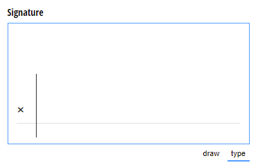
A signature field will default to the Draw & Type input option, however you can select just one or the other.
- Draw - Enables the form user to handwrite their signature.
- Type - Enables the form user to type their signature.
- Draw & Type - Enables the form user to include both a handwritten and typed signature.
Label
The label will display as the title of the field or the question that is being asked on the form. You can select the icon on the right to hide the label on the form. You also can use the pop-up formatting toolbar to insert values from other fields on the form.
Values from protected fields cannot be inserted into the field label.
Help Text
Help text can be used to assist the user by providing additional instructions. Help text will display directly under the field. Use the formatting toolbar to format text, insert hyperlinks and images, and populate values from other fields on the form.
Values from protected fields cannot be inserted into the help text.
Show This Field
By default, fields will always display on the form. However, you may want to hide specific fields or sections based on certain conditions, such as a selected value of another field on the form.
- Always – Field is always shown.
- When – Field will only display when specific conditions are met. After selecting this option, the Conditional Logic Builder dialog will display allowing you to select when the field or section should be displayed.
- For Roles – Field will display only when accessed via a role-based workflow link specific to the role(s) selected.
- Never – Field will never display.
Require This Field
Requiring a field will make sure the user provides a response. When a field is required, an error message will display, and the form cannot be submitted until a value has been added to the field. Required fields are indicated by a red asterisk next to the label. By default, fields are never required.
- Always – Field is always required. User must provide a response in order to submit the form.
- When – Field is required only when specific conditions are met. After selecting this option, the Conditional Logic Builder dialog will display allowing you to select when the field is required.
- For Roles - Field is required only when accessed via a role-based workflow link specific to the role(s) selected.
- Never – Field is not required. This is the default behavior.
Read-Only
Set fields and sections as read-only to create simple workflows with your forms. All fields can be made read-only, with the exception of fields that are already read-only by default (Calculation, Price, Content, Page break, etc.).
- Always – Field is always read-only.
- When – Field is read-only when specific conditions are met. After selecting this option, the Conditional Logic Builder dialog will display allowing you to select when the field is read-only.
- For Roles – Field will be read-only when accessed via a role-based workflow link specific to the role(s) selected.
- Never – Field allows user input. This is the default behavior."
Custom Error
You can set a custom error message that will display under your field when specified conditions become true. The conditional logic builder will allow you to add any number of rules for validating your field. Learn more about the custom error option.