A Textbox field is used to collect free-form, text-based responses. The user can type in any combination of letters or numbers in response to the question.
Label
The label will display as the title of the field or the question that is being asked on the form. You can select the icon on the right to hide the label on the form. You also can use the pop-up formatting toolbar to insert values from other fields on the form.
Values from protected fields cannot be inserted into the field label.
Placeholder Text
Placeholder Text is a short prompt that describes the expected value of an input field. The prompt is displayed in the field before you enter a value, and disappears when you begin typing.
Type
Single Line
Single Line textboxes are intended for short answer responses.
Multiple Lines
Multiple Line textboxes are intended for questions that may take more than a few words to answer such as a comments box on a contact form. Multiple line textboxes get larger as you type into them (up to 9 lines).
Password
With data encryption enabled, you can securely collect passwords that are masked from view with asterisks.
Format Validation
You must encrypt any form and protect any field that contains sensitive information, such as: Social Security numbers, Driver’s license numbers, Banking information, and other personally identifiable information. Learn more about data encryption.
Format validation allows you to validate (and potentially reformat) user input. For example: a Textbox field with format validation set to Numeric will require users to enter only numbers. You can choose from a variety of standard formats, or specify your own custom format:
-
Alphabetic – Requires users to enter only letters.
-
Numeric – Requires users to enter only numbers.
-
Alphanumeric – Requires users to enter only numbers or letters.
-
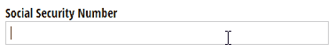
SSN – Requires users to enter a 9-digit Social Security number, which is automatically reformatted to ###-##-####.
-
Zip Code – Requires users to enter either a 5-digit or 9-digit Zip code.
-
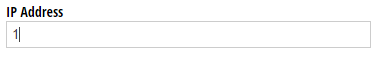
IP Address – Requires users to enter a 4-number IP address, separated by periods (#.#.#.#.). If the address is not formatted correctly, an error message will appear:
-
MAC Address – Requires users to enter a 12 character MAC address, which is automatically reformatted to ##:##:##:##:##:##.
-
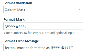
Custom Mask – Requires users to enter a numeric or alphabetic value in a custom format. When creating your mask, use # for numbers, @ for letters, and () around optional inputs. Then, write the error message that appears when user input is not formatted correctly.
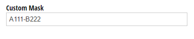
When users don’t input their answers correctly, your error message will appear:
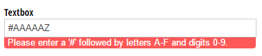
- Custom Regular Expression – Enter a custom regular expression (regex for short) to validate user input. For example; if you wanted a user to input a Hex color code (typically formatted as a “#” followed by 3/6 numbers or letters between A-F), you could use the following regular expression:
^#([A-Fa-f0-9]{6}|[A-Fa-f0-9]{3})$
Regular Expressions
When you want to validate user input beyond just a sequence of numbers and letters, regular expressions (regex for short) allow you to validate or reformat very specific strings of text. For example; if you wanted a user to input a Hex color code (typically formatted as a “#” followed by 6 numbers or letters from A-F), you could use the following regular expression:
^#([A-Fa-f0-9]{6}|[A-Fa-f0-9]{3})$
After you include an error message, the user will encounter an error if their code is not formatted correctly:
You also have the ability to reformat a regular expression. For example; you can require users to enter either “abcd” or “ab cd” using the following expression:
^(ab) ?(cd)$
You can then reformat the expression to ensure that there is a space between “ab” and “cd”:
$1 $2
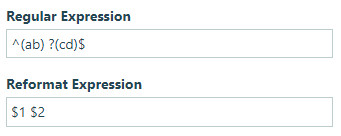
In this expression, “1” and “2” represent the two groups inside the two sets of parentheses, and we’ve added a single space between them. Now, if a user enters “abcd”, the Textbox will automatically reformat the string to include a space.
Regular expressions can be tricky depending on what you’re trying to achieve. There are many useful tools online that can help you write your regular expressions; you can find a cheat sheet to review some of the basics here. Additionally, to test your expressions, RegExr is a great tool.
Default Value
Default values can be used to automatically populate the field’s value for the user. The user can then choose to change the default value before submitting the form.
The default value can always be the same value or can change based on certain conditions such as a selected value of another field on the form. To set a changing default value, click the lightening bolt icon in the field to open the Conditional Logic Builder.
Number of Characters
Set a minimum and/or maximum number of characters that the user is allowed to enter into this field. Spaces count toward the character limits.
When the number of characters entered is below the minimum, an error message will display and the form cannot be submitted until the specified number of characters have been entered. When the number of characters entered reaches the maximum limit, the form user cannot enter additional characters.
Help Text
Help text can be used to assist the user by providing additional instructions. Help text will display directly under the field. Use the formatting toolbar to format text, insert hyperlinks and images, and populate values from other fields on the form.
Values from protected fields cannot be inserted into the help text.
Show This Field
By default, fields will always display on the form. However, you may want to hide specific fields or sections based on certain conditions, such as a selected value of another field on the form.
- Always – Field is always shown.
- When – Field will only display when specific conditions are met. After selecting this option, the Conditional Logic Builder dialog will display allowing you to select when the field or section should be displayed.
- For Roles – Field will display only when accessed via a role-based workflow link specific to the role(s) selected.
- Never – Field will never display.
Require This Field
Requiring a field will make sure the user provides a response. When a field is required, an error message will display, and the form cannot be submitted until a value has been added to the field. Required fields are indicated by a red asterisk next to the label. By default, fields are never required.
- Always – Field is always required. User must provide a response in order to submit the form.
- When – Field is required only when specific conditions are met. After selecting this option, the Conditional Logic Builder dialog will display allowing you to select when the field is required.
- For Roles - Field is required only when accessed via a role-based workflow link specific to the role(s) selected.
- Never – Field is not required. This is the default behavior.
Read-Only
Set fields and sections as read-only to create simple workflows with your forms. All fields can be made read-only, with the exception of fields that are already read-only by default (Calculation, Price, Content, Page break, etc.).
- Always – Field is always read-only.
- When – Field is read-only when specific conditions are met. After selecting this option, the Conditional Logic Builder dialog will display allowing you to select when the field is read-only.
- For Roles – Field will be read-only when accessed via a role-based workflow link specific to the role(s) selected.
- Never – Field allows user input. This is the default behavior."
Limit Quantity
You can set quantity limits and track quantities for your field. Quantity limits are useful for product orders, ticket sales, signups, reservations, and any other scenario for which there’s a limit to the number of times a specific value may be selected.
- No Duplicates – Limit the quantity allowed to just one. Once your limit is set, you can write a custom error message to display when the limit is exceeded.
- Specific Quantity – Specify a quantity limit greater than one. This value can be either a constant integer, or an integer calculation.
Custom Error
You can set a custom error message that will display under your field when specified conditions become true. The conditional logic builder will allow you to add any number of rules for validating your field. Learn more about the custom error option.