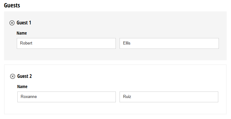
A Repeating Section is a container used to group a set of fields that repeats as needed, allowing people to add multiple instances of the section to the form. Repeating sections can also be converted to Table fields when necessary.
In the form entry view, repeating data will appear when you collapse an individual entry. When you export repeating data to Excel, the information will be placed on a separate sheet within the same workbook.
Label
The label will display as the title of the field or the question that is being asked on the form. You can select the icon on the right to hide the label on the form. You also can use the pop-up formatting toolbar to insert values from other fields on the form.
Values from protected fields cannot be inserted into the field label.
Item Label
The Item Label is the title of each repeating item. A number follows the Item Label to indicate how many repeating items the user has added.
Add Button Text
Customize the text beside the + button that enables a form user to add a new section. Or, leave this field blank to include just the + button at the bottom of the section instead.
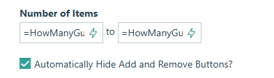
Number of Items
Set the minimum and maximum number of items that your users can add to a repeating section. Use static numbers such as “1” and “5”, or set calculated limits based on other fields. The minimum limit is the default number of items that appear when a form initially loads. When a minimum of zero items is set, the fields in the section will not appear until the user adds them.
For example: On a job application form, you can specify how many references someone can add to their application. Setting a static limit with basic numbers, like “1” and “3”, is simple. Now, the applicant must add at least one, but no more than three references.
Or, say you have an event registration form. With this feature, you can specify the number of guests that someone can bring.
Automatically Hide Add and Remove Buttons?
This option is available when a minimum or maximum number of items is set. When the maximum number of items has been reached, the add button will no longer appear, and users will not be able to add additional items. When the minimum number of items is reached, the remove buttons will no longer appear, and users will not be able to remove items.
When this option is enabled, you can dynamically add or remove rows based on specified minimum and maximum values. For instance, if users enter the number of guests in a Number field, that value can automatically determine the minimum and maximum number of rows displayed.
First, set the maximum and minimum values to the Number field:
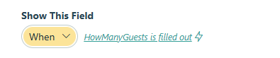
Optionally, set the repeating section to only display when the user indicates the number of guests:
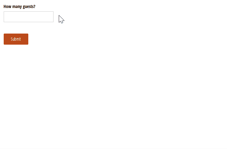
Now, when the user enters the number of guests, the repeating section will dynamically adjust to display the corresponding number of items. If the user reduces the number of guests, the excess items will be deleted automatically.
Help Text
Help text can be used to assist the user by providing additional instructions. Help text will display directly under the field. Use the formatting toolbar to format text, insert hyperlinks and images, and populate values from other fields on the form.
Values from protected fields cannot be inserted into the help text.
Show This Field
By default, fields will always display on the form. However, you may want to hide specific fields or sections based on certain conditions, such as a selected value of another field on the form.
- Always – Field is always shown.
- When – Field will only display when specific conditions are met. After selecting this option, the Conditional Logic Builder dialog will display allowing you to select when the field or section should be displayed.
- For Roles – Field will display only when accessed via a role-based workflow link specific to the role(s) selected.
- Never – Field will never display.
Read-Only
Set fields and sections as read-only to create simple workflows with your forms. All fields can be made read-only, with the exception of fields that are already read-only by default (Calculation, Price, Content, Page break, etc.).
- Always – Field is always read-only.
- When – Field is read-only when specific conditions are met. After selecting this option, the Conditional Logic Builder dialog will display allowing you to select when the field is read-only.
- For Roles – Field will be read-only when accessed via a role-based workflow link specific to the role(s) selected.
- Never – Field allows user input. This is the default behavior."
Custom Error
You can set a custom error message that will display under your field when specified conditions become true. The conditional logic builder will allow you to add any number of rules for validating your field. Learn more about the custom error option.