A Number Field is used to collect number values such as integers, decimals, or percentages. The user will only be able to input numbers into this field.
Label
The label will display as the title of the field or the question that is being asked on the form. You can select the icon on the right to hide the label on the form. You also can use the pop-up formatting toolbar to insert values from other fields on the form.
Values from protected fields cannot be inserted into the field label.
Type
Collect three different types of numerical input:
Integer
Integer will display as a number #,### without a decimal value. Integer values cannot exceed 2,147,483,647.
Decimal
Decimal will display as a number #,###.## with a decimal value. You can specify the number of decimal places from 0 to 10.
Percent
Percent will display as a number #,###.## % with a decimal value. You can specify the number of decimal places from 0 to 10.
Style
Display numerical input in three different styles:
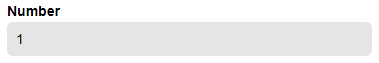
Textbox
Collect input with a simple textbox.
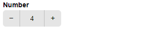
Spinner
Number fields in tables cannot be set to the Spinner style.
Scroll through number values with the plus and minus options. Use the Increment By option to display values on a fixed scale. The maximum range limit is 1,001.
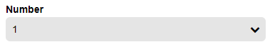
Dropdown
Select number values from a dropdown menu. Use the Increment By option to display values on a fixed scale. The maximum range limit is 1,001.
Range
Ranges can be specified to require the user to enter a value between the minimum and maximum values that you set for the field.
Placeholder Text
Placeholder Text is a short prompt that describes the expected value of an input field. The prompt is displayed in the field before you enter a value, and disappears when you begin typing.
Help Text
Help text can be used to assist the user by providing additional instructions. Help text will display directly under the field. Use the formatting toolbar to format text, insert hyperlinks and images, and populate values from other fields on the form.
Values from protected fields cannot be inserted into the help text.
Default Value
Default values can be used to automatically populate the field’s value for the user. The user can then choose to change the default value before submitting the form.
The default value can always be the same value or can change based on certain conditions such as a selected value of another field on the form. To set a changing default value, click the lightening bolt icon in the field to open the Conditional Logic Builder.
Show This Field
By default, fields will always display on the form. However, you may want to hide specific fields or sections based on certain conditions, such as a selected value of another field on the form.
- Always – Field is always shown.
- When – Field will only display when specific conditions are met. After selecting this option, the Conditional Logic Builder dialog will display allowing you to select when the field or section should be displayed.
- For Roles – Field will display only when accessed via a role-based workflow link specific to the role(s) selected.
- Never – Field will never display.
Require This Field
Requiring a field will make sure the user provides a response. When a field is required, an error message will display, and the form cannot be submitted until a value has been added to the field. Required fields are indicated by a red asterisk next to the label. By default, fields are never required.
- Always – Field is always required. User must provide a response in order to submit the form.
- When – Field is required only when specific conditions are met. After selecting this option, the Conditional Logic Builder dialog will display allowing you to select when the field is required.
- For Roles - Field is required only when accessed via a role-based workflow link specific to the role(s) selected.
- Never – Field is not required. This is the default behavior.
Read-Only
Set fields and sections as read-only to create simple workflows with your forms. All fields can be made read-only, with the exception of fields that are already read-only by default (Calculation, Price, Content, Page break, etc.).
- Always – Field is always read-only.
- When – Field is read-only when specific conditions are met. After selecting this option, the Conditional Logic Builder dialog will display allowing you to select when the field is read-only.
- For Roles – Field will be read-only when accessed via a role-based workflow link specific to the role(s) selected.
- Never – Field allows user input. This is the default behavior."
Custom Error
You can set a custom error message that will display under your field when specified conditions become true. The conditional logic builder will allow you to add any number of rules for validating your field. Learn more about the custom error option.