Learn to quickly build online forms that are easy to fill out, no matter what device is used. With Cognito Forms, every form is fully responsive by default, so you don’t have to do the work to make it happen.
Build Time & Skill
5-15 min
Beginner
What you'll learn
How Cognito Forms handles mobile responsiveness automatically, plus practical tips to optimize your forms for the best possible experience on any device

Nearly 60% of global website traffic comes from mobile devices. That means the majority of people who click a link to your form are opening it on a phone, not a desktop. If your form doesn’t work well on a small screen, you risk losing submissions before they even start.
The good news is that you don’t have to be a developer or designer to get this right. Cognito Forms handles the technical side of mobile responsiveness for you automatically, so every form you publish works on any device from day one. On top of that, a few quick adjustments can make your forms even easier for mobile users to complete.
Mobile-friendly forms are important because they help you:
- Capture more submissions. Respondents who hit friction on mobile (whether that means a field that doesn’t load right, text that’s hard to read, or buttons that are too small to tap) are more likely to abandon forms before finishing. Responsive forms remove those barriers.
- Collect cleaner data. When forms are easy to use on mobile, people fill them out more carefully. Fewer mistakes, fewer incomplete submissions.
- Project a professional image. A polished form experience tells clients and customers that you pay attention to the details. A broken or clunky mobile experience tells them the opposite.
- Reach more people, more often. Forms that work on any device let customers engage with you in the moment, whether they’re on the go, between meetings, or filling something out from their couch.
What Cognito Forms Handles for You Automatically
You don’t need to configure anything to make your forms mobile-friendly.

Every form you publish in Cognito Forms is fully responsive and scales to fit any screen size automatically. Here’s what that looks like in practice:
Forms with multiple columns adjust automatically.
If you’ve arranged fields side by side on desktop, or used a special field that does this for you automatically (like a Name field with two sub-fields for first and last name), those fields stack into a single column on mobile automatically. The same applies to address fields and any other multi-column layout. Nothing overlaps, and nothing gets cut off.

The right keyboards pop up when input is needed.
When a mobile user taps into a Number field or the ZIP code field inside an Address field, their device automatically opens the number keypad instead of the full text keyboard. This small detail makes a real difference because users don’t have to manually switch keyboards to enter a phone number or zip code.
Special field types adjust for you.
If your form uses one of our special field types (like Rating Scales, Signature fields, Repeating Sections, or Tables), everything is automatically adjusted to fit the screen size of the device accessing the form, ensuring they are touch-friendly.
The whole experience is mobile-friendly, not just the form itself.
Your respondents can fill out and submit forms from any device. Your team can view and manage entries on the go. And if you need to make a quick edit or add a field, the Build page works from your phone too. Cognito Forms works the way you’d expect it to on any device.
4 Mobile Forms Best Practices
The auto-responsive behaviors above give you a solid baseline. These four tips help you go further, making your forms faster to complete and easier to use for anyone on a phone.
1. Choose the right field types for touch screens
Typing on a phone is slower and more error-prone than typing on a keyboard. Wherever you can reduce the amount of typing your users need to do, you reduce friction and increase the chance they finish the form.
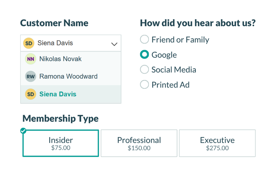
Use dropdowns and choice fields instead of open-text fields whenever possible.
For questions like “What’s your industry?” or “How did you hear about us?”, a Choice field almost always works better than a Textbox field on mobile. As a general rule: if you have six or more options, set the field’s style to Dropdown. If you have fewer than six options, select one of the other style options (radio buttons, cards, or checkboxes) so users can see all answer choices on the screen, rather than scroll through them or type one in.
We always recommend limiting open-text fields to situations where free-form input is truly necessary. When users spend less time typing, they’re more likely to complete the form (and more likely to do so accurately).

Set input validation on fields that require specific formats.
If you expect a specific format from respondents, add validation so users get a clear error message immediately if they make a mistake, rather than submitting data that you have to correct later.
Here are a few validation options you can try:
- For Textbox fields : Find the Format Validation setting to validate (and potentially reformat) user input. For example: a Textbox field with format validation set to Social Security Number (SSN) will require users to enter only nine digits. In the GIF you'll notice the field does not allow letters or more than nine digits. You can choose from a variety of standard formats, or specify your own custom format. Learn more about Format Validation here.
- For Date, Number, or Currency fields : Try adding a Range to limit what can be entered. Ranges require the user to enter a value between the minimum and maximum values that you set for the field.
- For any field type : Try setting up your own custom error message that will display under your field when specified conditions become true. For example, display a custom error on a Date field when a Sunday is selected and your business is closed. Using both advanced and conditional logic, you can add any number of rules for validating your field. Learn more about Custom Errors here.
Set input validation on fields that require specific formats.
If you expect a specific format from respondents, add validation so users get a clear error message immediately if they make a mistake, rather than submitting data that you have to correct later.
Here are a few validation options you can try:
- For Textbox fields: Find the Format Validation setting to validate (and potentially reformat) user input. For example: a Textbox field with format validation set to Numeric will require users to enter only numbers. You can choose from a variety of standard formats, or specify your own custom format. Learn more about Format Validation here.
- For Date, Number, or Currency fields: Try adding a Range, to limit what can be entered. Ranges require the user to enter a value between the minimum and maximum values that you set for the field.
- For any field type: Try setting up your own custom error message that will display under your field when specified conditions become true. For example, display a custom error on a Date field when a Sunday is selected and your business is closed. Using both advanced and conditional logic, you can add any number of rules for validating your field. Learn more about Custom Errors here.

2. Keep your form short or use pages for longer forms
Long forms are harder to get through on any device, but on mobile, a wall of fields can feel especially overwhelming. The shorter your form, the more likely users are to finish it.
Only ask what you actually need right now
If there’s information you could collect later (such as after a booking is confirmed, or once a client relationship is established), don’t include it on the intake form. Keep the upfront ask small.
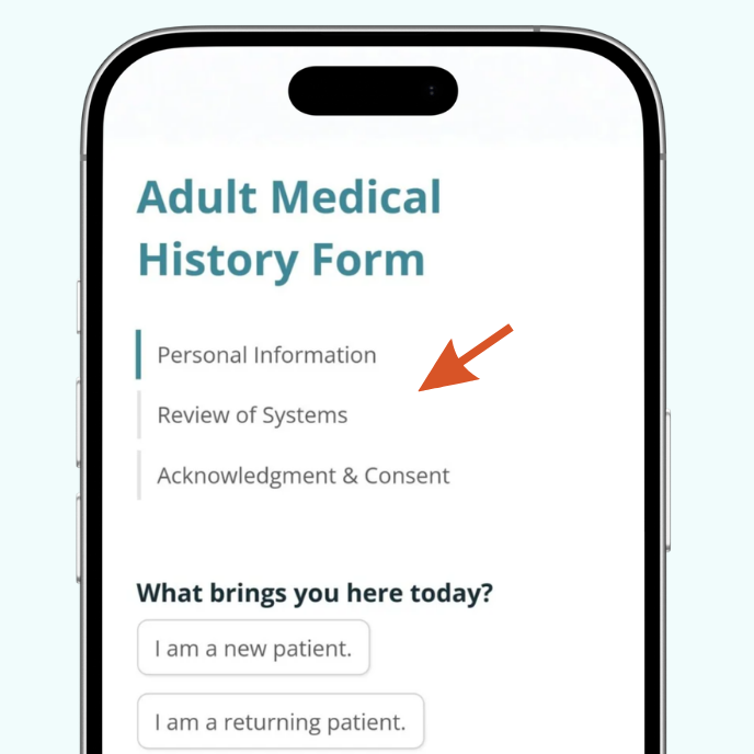
Break longer forms into pages
If your form genuinely needs many fields, use Cognito Forms’ Page Break field to divide it into short, focused steps. A form with four pages of three fields each feels much more manageable than one long scroll, especially on a phone.
Multi-page forms in Cognito Forms automatically include a progress indicator, so users can see how far along they are. This small visual cue reduces drop-off by letting people know the end is in sight.
Want to learn more about creating multi-page forms?
3. Use Conditional Logic to show only what’s relevant
Instead of showing every possible field to every user an overwhelming people with irrelevant fields, show each person only the fields that apply to their situation. Conditional logic is what lets you show or hide fields based on how a user has already answered, creating a cleaner, more focused user experience.
For example, if you ask “Do you have an existing account?”, you can set up conditional logic to show account-related fields only when the user answers “Yes.” Users who answer “No” skip right past those fields without ever seeing them. The form feels shorter, even if it technically has many fields.
How to add conditional logic from any field’s settings on the Build page:
- Click on the field you want to add logic to.
- Find Show This Field in the Settings pane on the left side of the Build page.
- Choose When and use the Conditional Logic Builder to set the conditions that control when it appears.
4. Test your form before sharing it
Before you send your form link to clients or customers, take a few minutes to check how it looks and behaves on a real mobile device. It’s the fastest way to catch anything that doesn’t feel quite right.
Send yourself the form link and fill it out from a mobile device as if you were a first-time user. Pay attention to how the keyboard behaves, how the form scrolls, and whether your fields appear correctly.
Check for these things specifically:
- Do fields stack cleanly into a single column?
- Is all text easy to read without zooming in?
- Are buttons large enough to tap comfortably?
- Do dropdowns and choice fields behave as expected?
Additional Features to Make Your Forms Even Easier on Mobile
Once your form is optimized, enable these built-in features to take the mobile experience one step further:
- Quickly share your mobile form by downloading or copying an auto-generated QR code. Anyone who scans the code will be taken directly to your form’s public link.
- Provide live address suggestions to reduce errors and speed up form completion. When a user starts typing their address, Cognito Forms’ integration with Google Address Autocomplete suggests valid addresses so they can select their address from a list instead of typing the full thing. On mobile, where typing is slower, this saves real time and reduces errors.
- Let people save their progress and pick up right where they left off. If someone is partway through a longer form and gets interrupted, Save & Resume lets them pick up exactly where they left off, without losing any of their answers. This is especially valuable for mobile users who may not complete a form in one sitting.
Start Building Mobile-Ready Forms Today
Every form you create in Cognito Forms is already set up to work well on any device. With a few deliberate choices, like the right field types, conditional logic, and a quick test before you publish, you can make the experience even smoother for the clients and customers filling them out.
Whether you’re collecting intake information, processing payments, or managing service requests, a well-built mobile form removes friction and helps you collect better information, faster.
FAQ
Cognito Forms does not have an official iOS or Android app. However, you can access Cognito Forms from any mobile browser to build forms, view entries, and share your form link. You can also save your organization’s link to your phone’s home screen to access it quickly, similar to an app shortcut.